RECORDING.....
Showing posts with label Billie Housden. Show all posts
Showing posts with label Billie Housden. Show all posts
Friday, 30 March 2012

Q5: How did you attract/address your audience?
Notes:
Our target audience was mainly 18+ but by using only CU's the audience would not see my age therefore would be able to get a Psychological feeling from the opening.
Q4: Who would be the audience for your media product?

 |
| Example of a Psychological thriller poster I have made a poster to show that the audience for our media product probably would not attract anyone under the age of 17-18. In the making of this poster, I followed the trends of films such as 'The skin I live in' and Black Swan'. I done this to make sure I stuck with the same Genre and therefore only really attract the right audience suited to this film.The specific audience i think this is aimed at is a wide variety of people from different classes, ages and genders based on it's USP. I think the USP in our opening is the suggestion of a twisted mind and a gripping storyline. It's a discrete yet chilling opening which is mostly run by nothing but suggestion. I think overall, our audience will be varied in age gender and class but will mostly be over 18's considering certain aspects of the opening. |
Friday, 23 March 2012


Wednesday, 14 March 2012
EVALUATION Q1. In what ways does your media product use, develop or challenge forms and conventions of real media products.
The conventions of film includes the name of the film, the cast and directers credits, production and distribution logos, graphics, music and soundtrack and action which hooks the audience. In our research for the film opening, we got to understand how the conventions of film openings, this helped us apply it with the credits and lack of knowledge to the spectator.
For example, i looked at Psycho mainly in my research for film conventions.
Graphics
Our opening follows the conventions of film openings pretty well. We showed all six aspects of film openings. we used graphics to show the production company at the beginning:


The Hook and Characters
Hooking an audience in the opening of any film is essential but for a thriller this is even more encouraged. To hook our viewers in the opening, we wanted to make it discrete and mysterious. Not only did we achieve this by being discrete but we managed to keep the hook and the Sub-Genre of Psychological. I think that in not showing our character fully, we added to this discrete opening. We put together an opening of close ups to create a mysterious storyline and more of a Psychological feel for the main character.
Music
We did not use a "soundtrack" through the opening which i believe is the one area where we went against the film opening conventions. This is mostly used in openings so that when it is played throughout the film, the spectator is familiar with the feeling they get at the beginning, almost like intertexuality but within just one film
Intertexuality
Intertexuality Is widely used with Psycho, we did not do the conventional stabbing with a knife and a women in the shower, but we did put this film in black and white which in my opinion shows intertexuality between these two films. Not only this, but the opening credits were both simple, bold, centered and in black and white. This, i think is a great way to show a Psychological thriller through credits.


Credits
The film title sequence always fits with the film. This gives the viewer the idea of what type of film the spectator is abouts to view. Although on their own, the opening credits do not signify a thriller but put together with the opening itself, i think it shows a thriller well.
For example:
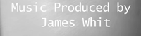 This text we used fitted well with our Genre and Mise-en Scene. The basic black and white colours we used were mianly influenced from film openings such as Psycho:

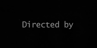 Checkmate. This text type shows a "typewriter" theme in which we used, however our title sequence was put together with sound effects, and camerawork to create this thriller feel for the spectator.
I think where the title sequence is concerned we definitely made it work well with our opening. Although we did make the font and style work well, the conventions of the title were played around a bit to make our opening more effective. For example, a film opening usually includes the title of the film which we decided to place at the end, we felt that giving the title away to the audience straight away, ruined it so we challenged the conventions to make it work best for us.
For example, i looked at Psycho mainly in my research for film conventions.
Graphics
Our opening follows the conventions of film openings pretty well. We showed all six aspects of film openings. we used graphics to show the production company at the beginning:

The Hook and Characters
Hooking an audience in the opening of any film is essential but for a thriller this is even more encouraged. To hook our viewers in the opening, we wanted to make it discrete and mysterious. Not only did we achieve this by being discrete but we managed to keep the hook and the Sub-Genre of Psychological. I think that in not showing our character fully, we added to this discrete opening. We put together an opening of close ups to create a mysterious storyline and more of a Psychological feel for the main character.
Music
We did not use a "soundtrack" through the opening which i believe is the one area where we went against the film opening conventions. This is mostly used in openings so that when it is played throughout the film, the spectator is familiar with the feeling they get at the beginning, almost like intertexuality but within just one film
Intertexuality
Intertexuality Is widely used with Psycho, we did not do the conventional stabbing with a knife and a women in the shower, but we did put this film in black and white which in my opinion shows intertexuality between these two films. Not only this, but the opening credits were both simple, bold, centered and in black and white. This, i think is a great way to show a Psychological thriller through credits.

Credits
The film title sequence always fits with the film. This gives the viewer the idea of what type of film the spectator is abouts to view. Although on their own, the opening credits do not signify a thriller but put together with the opening itself, i think it shows a thriller well.
For example:
 This text we used fitted well with our Genre and Mise-en Scene. The basic black and white colours we used were mianly influenced from film openings such as Psycho:
 Checkmate. This text type shows a "typewriter" theme in which we used, however our title sequence was put together with sound effects, and camerawork to create this thriller feel for the spectator.
 I think where the title sequence is concerned we definitely made it work well with our opening. Although we did make the font and style work well, the conventions of the title were played around a bit to make our opening more effective. For example, a film opening usually includes the title of the film which we decided to place at the end, we felt that giving the title away to the audience straight away, ruined it so we challenged the conventions to make it work best for us.
Friday, 9 March 2012
Wednesday, 7 March 2012
Evaluation of my Prelim
When shooting my prelim there was only one other person in my group. We made a storyboard together and came up with a script which both fitted together. We decided that where camerawork was concerned, we wanted to build it. To do this we used close up shots put together in which revealed the ending where she is walking into a room. We used close ups of feet, face and a swinging hand. Between these shots we also put in a cross cut to the girl waiting in the room.
Whilst shooting, we decided to get all close ups at once, then move on to shooting the conversation and then we finally filmed all the pieces which glued it together. This helped us organise our time and the amount of work needing to be done, we did not want to get down to editing and find out we needed more footage, luckily we did not have to.
As we only had two members in or group, we needed to film the script all as over the shoulder shots, we done this by filming one person saying all their lines then the other person, we then edited it so that it gave the idea of a conversation. Considering we could not get a two shot to show the conversation, I think the shots do reveal what is happening.
Things we learned whilst doing this prelim, is that planing ahead is essential. The storyboard helped us save time and not miss any key elements we needed. Another rule we learnt is that you need to work together to get a successful piece of work. Me and Cindy worked together throughout the storyboard, script, filming and editing.
Overall, I think that the prelim gave us a good rough idea on how to film well and how to be well organised. It was also a good practice run to give us a good idea of what problems and etc to expect through making our opening.
Whilst shooting, we decided to get all close ups at once, then move on to shooting the conversation and then we finally filmed all the pieces which glued it together. This helped us organise our time and the amount of work needing to be done, we did not want to get down to editing and find out we needed more footage, luckily we did not have to.
Where editing was concerned, we decided to turn it black and white, in my opinion this added to the video as a whole. Whilst editing we wanted to have a simple title opening. We went through a few "sample texts" but felt that the scrolling txt fitted best with our short video. We also did not add any colour to this title opening. We wanted it to fit well with the video so we felt it was best to stick with plain black and white.
The main problem we had whilst filming the prelim was lighting. We filmed a few shots but realised the lighting was letting it down. We then took out a dedo light which helped incredibly.
As we only had two members in or group, we needed to film the script all as over the shoulder shots, we done this by filming one person saying all their lines then the other person, we then edited it so that it gave the idea of a conversation. Considering we could not get a two shot to show the conversation, I think the shots do reveal what is happening.
Things we learned whilst doing this prelim, is that planing ahead is essential. The storyboard helped us save time and not miss any key elements we needed. Another rule we learnt is that you need to work together to get a successful piece of work. Me and Cindy worked together throughout the storyboard, script, filming and editing.
Overall, I think that the prelim gave us a good rough idea on how to film well and how to be well organised. It was also a good practice run to give us a good idea of what problems and etc to expect through making our opening.
Monday, 5 March 2012
Evaluation of Rough Cut
The first issue that arose was the length of the rough cut. It was only 1 minute long and in our plan we had hoped to have it around double this. Although we are concerned about this, we still have film which was not added and will be soon.
The shots we have so far however,I feel were effective and well edited. Although we are going to re-do the credits as we felt they needed to be in for longer and at different points, the way we plan on putting them in after this will be much more effective. As you can see, the rough cut at this point looks very unedited with lots of pauses but we plan on using these pauses to include some more opening credits. We also decided to put our own names in the credits.
As you can tell from the rough cut, we have yet to add the foley sound. Obviously, we plan on removing the current noises of the filming process we have on it. The story line at this point is shown as very broad and not quite clear but we plan on changes the places of some of these shots to try and make it a bit more clearer to the spectator what the story line.
I think the weakest point of our opening so far is the long pauses between each shot, which does not allow the opening to flow. We will be modifying the credits and adding in some more to create a more thriller feel.
Overall, i would say that although the rough cut at the moment is too short and needs further work on sound and editing, i feel this is a good basis to grow from.
The shots we have so far however,I feel were effective and well edited. Although we are going to re-do the credits as we felt they needed to be in for longer and at different points, the way we plan on putting them in after this will be much more effective. As you can see, the rough cut at this point looks very unedited with lots of pauses but we plan on using these pauses to include some more opening credits. We also decided to put our own names in the credits.
As you can tell from the rough cut, we have yet to add the foley sound. Obviously, we plan on removing the current noises of the filming process we have on it. The story line at this point is shown as very broad and not quite clear but we plan on changes the places of some of these shots to try and make it a bit more clearer to the spectator what the story line.
I think the weakest point of our opening so far is the long pauses between each shot, which does not allow the opening to flow. We will be modifying the credits and adding in some more to create a more thriller feel.
Overall, i would say that although the rough cut at the moment is too short and needs further work on sound and editing, i feel this is a good basis to grow from.
Friday, 2 March 2012
Rough Cut of Opening
This is the rough cut of our final opening. We still need to fix up our titles and sound.
Thursday, 1 March 2012
My Prelim Storyboard
 |
| Storyboard 1 |
 |
| Storyboard 2 Here are the storyboards Me and Cindy used to organise our prelim filming. |

Friday, 24 February 2012


Filming Pictures!
Checkmate Filming
We took some pictures during our first filming session to show some effects we hoped to achieve:
 |
| The chess pieces on our board. |
 |
| We wanted to create a shadow of the pieces for good Mise-En-Scene. |
 |
| This picture shows us creating the shadow with an artificial light |
 |
| The end result. |

We took this picture to show the difference between using the artificial light and having the normal room light. As you can see, our end result was much more effective for the audience.
Tuesday, 21 February 2012
Props
The chess board that we plan on using:

Similar to the chess board used in X-Men, one of the films in which we drew inspiration from, we thought that choosing a glass chess board rather than a plastic one would add more to the creepy atmosphere that we wish to create.

Similar to the chess board used in X-Men, one of the films in which we drew inspiration from, we thought that choosing a glass chess board rather than a plastic one would add more to the creepy atmosphere that we wish to create.
Monday, 20 February 2012
Location for filming


Here are some pictures of the location we filmed the walking shots in. We chose it because it was easily accessible and a fairly quiet area plus it had the right mise en scene.
Wednesday, 8 February 2012
Adjustments to final idea.
When discussing our final idea in depth we came up with something extra to add which we thought would be more effective and make our opening look more interesting. When filming the movement of each chess piece, we will add cross cuts to the character who was initially going to be murdered at the end and show that with each movement of the specific pieces, they are one step closer to death.
For EXAMPLE: a shot of a pawn piece moving will cross cut to the victim walking down the road, another cross cut will then go back to the chess board and show another movement which then cross cuts back to the victim and shows someone following them.
Subscribe to:
Posts (Atom)